Introduction
Introducing Carbon UI Elements
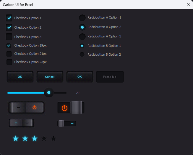
Carbon UI Elements - Interactive Flat UI Images modified from a PSD Carbon UI Kit PSD by Graphicsfuel.com to use on a UserForm
Here is a Material design that allows you to add interactive Checkboxes, Radiobuttons, Sliders, Rocker Buttons, Toggle Buttons, Buttons and a 5 Star Rating to a UserForm. Carbon UI Elements use a minimal Colour theme and gorgeous Graphics. The Images are isolated, edited and then extracted out of a Free PSD Carbon UI Kit
All of these elements' states can be saved as they are used, in Named Ranges on a Worksheet, for example the 5 Star Rating is saved as either '0' for no Star Rating (zero Stars) or 3 for a 3 Star Rating (3 Stars highlighted and selected). When the UserForm is displayed the states for all of the elements are initialised, for example if a Checkbox state is TRUE then it will be Checked
All of the Images loaded into the Image Controls are available in the Download File and I have also saved them as SVG. To edit the Button Text properly, you should use an Art Package for example Paint Shop Pro, Photoshop or Affinity Designer (I use Affinity for all of my work). The Images can also be copied from one UserForm to another without any editing
Carbon UI Elements use two tiny Classes from UserForm Extensibility to enable the Hand Cursor on a MouseOver action on an image and a Pause in milliseconds. The Toggle Button uses additional Code in the UserForm to move the Button back and forth with easing and to change the On/Off Icons. Other additional Code is also supplied to enable the Sliders, Rocker Switches and 5 Star Ratings
If you like this Project you may also enjoy
Blue UI Elements · UserFOrm UI · BoX · Flat UI · UserForm Slider Buttons · UserFormExtensibility
Prerequisites
- Excel 2016 (32bit or 64bit version 16.0)
- Basic to moderate Excel Skills to understand and edit Code, also to copy & paste Images into UserForm Controls if developing this Software further or integrating it into your own Projects. In order to edit the Button Text an Art Package is required; this may be Paint Shop Pro, Photoshop or Affinity Designer or a Package that can open and edit PSD files -- Please Note: the PSD file is available as a FREE download but DOES NOT ship with this Software
- Windows PC · NOT a Mac!
- No support is provided for customization of this Software
Features
- UserForm UI Elements consists of Checkboxes (3 different sizes), Radiobuttons (2 different sizes), Buttons (1 interactivity design with multiple states, requires an Art Package to edit the Text), Slider, Toggle Buttons (2 different sizes), Rocker Buttons (2 different sizes) and a 5 Star Rating (series of Stars that can be highlighted and selected by a Mouse click)
- Easing is used for the Toggle Button
- Features a Cursor Class that displays the Hand Cursor on the Flat UI Elements
- Features a Timing Class to enable a Millisecond Pause
- All of the individual Checkbox, Radiobutton, Button, Toggle Button, Slider, Rocker Button and 5 Star Rating Images are included in the download as 'PNG' and 'SVG' files including the 'OK' and 'Cancel' Button Images I created from the PSD. I also now include my edited Affinity Designer Images as well
- Before Purchasing!: The Carbon UI Kit PSD file by Graphicsfuel.com is FREE to download for all of the Elements used by this Software including the Button Text but it is NOT included in this Software. What IS included is shown in the Screen Shot above
Installation
Right-click on the file, 'CarbonUI.zip' and extract the contents to your computer. Lots of Image files are included with this Software. The main file is called 'CarbonUI.xlsm' and I have also added my Transparent Images Software, 'ImageTransparency.xlsm' that will allow you to load in PNG with Transparency set to a Background Colour. To use open the 'CarbonUI.xlsm' file
Usage
Carbon UI Elements
How to Use
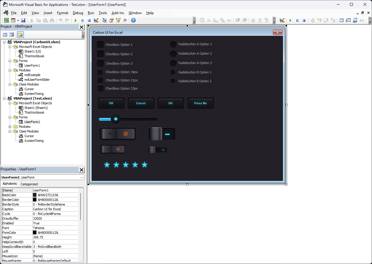
To use these Controls Open your own Project and the 'CarbonUI.xlsm' file in the VBE Editor and drag the UserForm1 into your own Project. Then drag both the 'Cursor' Class and the 'SystemTiming' Class into your own Project. Finally drag the 'mdExample' Code Module and the 'mdUserFormSlider' Code Module into your own Project. I will use a new file called 'Test.xlsm' to demonstrate and here is a Screen Shot after I have copied the Code Modules across (Compile the Code - there should not be any errors):
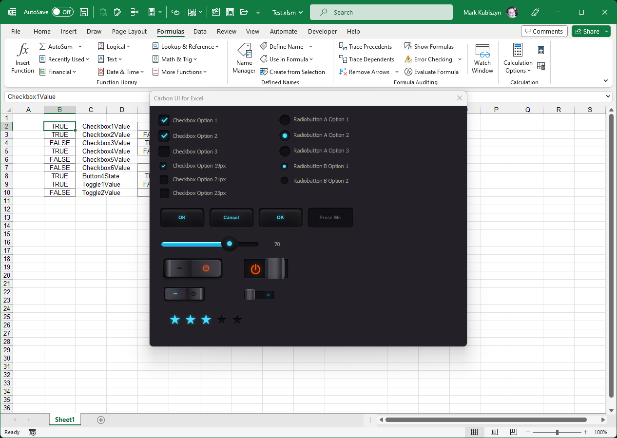
Now before you can start to use any of these Controls on your UserForm you need to add the Defined Names for all of the Control states into your Project or at the very least the ones that you intend to use. If you do not do this then you will receive Errors once the UserForm is displayed and you attempt to click or Move over the Controls. Also, you will not be able to store the states of the Controls correctly. I added an 'On Error Resume Next' into the UserForm_Initialize() Event Handler so that at least you can run the Example in the 'mdExample' Code Routine to view the UserForm and its Controls without triggering any errors. Anyhow, now add the Following Defined Names or Named Ranges into any Cells in any of your own Project Worksheets, using either the Name Box (quickest method, simply Copy mone and Paste) or the Name Manager on the 'Formulas' Tab of Excel - select New and type the Name 'Checkbox1Value' and so on and so forth...
' 6 Checkbox Values
Checkbox1Value
Checkbox2Value
Checkbox3Value
Checkbox4Value
Checkbox5Value
Checkbox6Value

' 2 Toggle Values
Toggle1Value
Toggle2Value

' 1 Button state
Button4State

' Radiobuton Group A ID
RadiobuttonASelected

' Radiobuton Group A Values
ARadiobutton1Value
ARadiobutton2Value
ARadiobutton3Value

' Radiobuton Group B ID
RadiobuttonBSelected

' Radiobuton Group A Values
BRadiobutton1Value
BRadiobutton2Value
BRadiobutton3Value

' 5 Star Rating
Rating

' Slider
Cell "J12" will be used by the Code

' Rocker Switches
Switch1Value
Switch2Value
Now in the 'mdExample' Code Module in your Project, run the Example and test out the Controls. You can check out my Code to see how each Checkbox, Radiobutton, Button, Slider, Toggle Button, Rocker Button and 5 Star Rating is controlled by the VBA. You should see the UserForm in your own Project now like this. Test each Control by hovering over the Images and pressing the Mouse Button or by Sliding the Slider Button along to set a new value:
More Info
Checkboxes
These require 2 Images, some initilisation code and additional code to make them interactive. An example of how I do this is shown below by the following Checkbox Event Handler:
' Initialisation Code
Private Sub UserForm_Initialize()
   ' Checkbox Initialisation
   If [Checkbox1Value].Value2 Then Tick Me.Checkbox1, True Else Untick Me.Checkbox1, True
End Sub

' Event Handler Code
Private Sub Checkbox1_MouseMove(ByVal Button As Integer, ByVal Shift As Integer, ByVal X As Single, ByVal Y As Single)
   MouseCursor.AddCursor IDC_HAND
End Sub

Private Sub Checkbox1Ticked_MouseMove(ByVal Button As Integer, ByVal Shift As Integer, ByVal X As Single, ByVal Y As Single)
   MouseCursor.AddCursor IDC_HAND
End Sub

Private Sub Checkbox1_MouseDown(ByVal Button As Integer, ByVal Shift As Integer, ByVal X As Single, ByVal Y As Single)
   If Button = 1 Then
      Tick Me.Checkbox1
      [Checkbox1Value].Value2 = True
   End If
End Sub

Private Sub Checkbox1Ticked_MouseDown(ByVal Button As Integer, ByVal Shift As Integer, ByVal X As Single, ByVal Y As Single)
   If Button = 1 Then
      Untick Me.Checkbox1
      [Checkbox1Value].Value2 = False
   End If
End Sub

' Tick()/Untick(), allows a Mouse click toggle action on the Image Controls whilst still maintaining the Hand Cursor
' - we don't want to see the ugly Pointer appear during the user interaction
' - use of the Init Parameter helps to initialise lots of Checkboxes otherwise you may see the bright Ticks disappear when the UserForm is displayed
Private Sub Tick(ByVal UserFormControl As Control, Optional ByVal Init As Boolean = False)
   If Init Then
      Me.Controls(UserFormControl.Name & "Ticked").Visible = msoTrue
      Me.Controls(UserFormControl.Name).Visible = msoFalse
   Else
      Me.Controls(UserFormControl.Name & "Ticked").Visible = msoTrue
      Me.Controls(UserFormControl.Name & "Ticked").ZOrder msoBringToFront
      Me.Controls(UserFormControl.Name).ZOrder msoSendToBack
   End If
End Sub

Private Sub Untick(ByVal UserFormControl As Control, Optional ByVal Init As Boolean = False)
   If Init Then
      Me.Controls(UserFormControl.Name & "Ticked").Visible = msoFalse
      Me.Controls(UserFormControl.Name).Visible = msoTrue
   Else
      Me.Controls(UserFormControl.Name & "Ticked").ZOrder msoSendToBack
      Me.Controls(UserFormControl.Name).Visible = msoTrue
      Me.Controls(UserFormControl.Name).ZOrder msoBringToFront
   End If
End Sub
I won't go into all of the Code here otherwise nobody would purchase my Software! All of the Image Controls, their respective Images and full Code including the Hand Cursor Class are available in the Purchased file...
Button States
Buttons
The Buttons available in this Software act like normal Buttons with a MouseOver effect. A Button will display a different Image as the Mouse rolls over it and then you can make the Button 'do soomething' like close the UserForm. Another type of Button will depress, pause for a brief time in Milliseconds before 'doing something'. Finally I have added a Button that can be Pressed permanently or Pressed and then Unpressed again with its State stored in a Defined Name or Named Range. Here are the 4 Buttons in the Software each with slightly different interactivity:

Editing the Button text
It is not easy to replicate how the PSD Buttons with different Text look as it will include 'pixelation for the Text' SO you should download the PSD from here and edit the individual Button Font etc. and then export/save your new Images out as PNG and load them into your UserForm Image Controls using my 'ImageTransparency.xlsm' Software. Here is the link to the Free PSD Carbon UI Kit
Once downloaded use Paint Shop Pro, Photoshop or Affinity Designer to isolate, select and edit the Font and Text for the Buttons. Export out at whatever size you require:
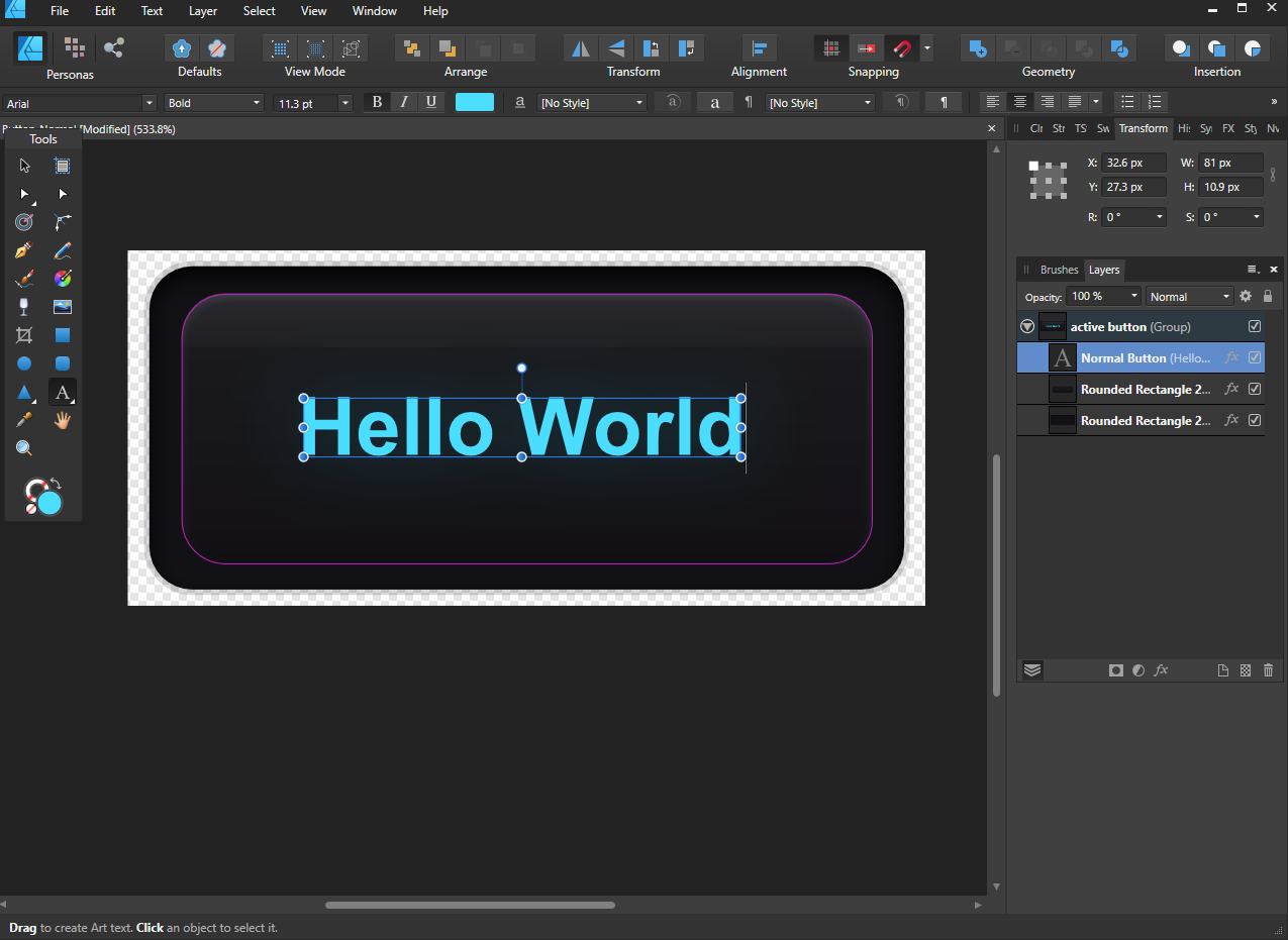
Round Buttons and Sliders are also included in Graphicsfuel.com's design on Free PSD Carbon UI Kit - here is an example of this excellent work, click to view:
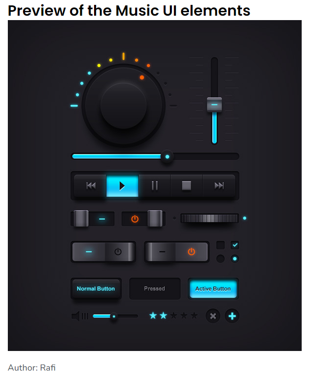
Elements or Controls (all built with Image Controls) included with this Software
Carbon UI Elements. All of these Elements are Image Controls manipulated using VBA to allow Interactivity

5 Star Rating. Add a Star Rating to your UserForm and capture the output of the user selection. The interactivity is a smooth scroll across all of the Stars until one is selected by a Mouse click. To undo or restart the process simply click the Mouse again

Rocker Switch. Add a Rocker Switch to your UserForm and capture the output of the On/Off action by the user. The interactivity is a simple Mouse click on either side of the Switch to depress it and change the action. In addition to this the Image will show either a bright Orange On action or a bright Blue Off action


Toggle Button. Add a Toggle Button to your UserForm and capture the output of the On/Off action by the user. The interactivity is a simple Mouse click on either side of the Switch to depress it and change the action. In addition to this the Image will show either a bright Orange On action or a bright Blue Off action


Slider Button. Add a Slider Button to your UserForm and capture a Range value ie. 1 to 100 set by the user as they drag the Slider. The interactivity is a beautifully smooth Grab and Drag using the Mouse on the main Button. A Drag to the left will set the Slider to its Minimum position and a Drag to the right will set the Slider to its Maximum position. The Toggle Button was exported out as a GIF Image so as to preserve its transparency and it was then loaded directly into the Image Control as opposed to loading via my Transparent Image Software included with this purchase/download

Buttons. The Buttons available in this Software act like normal Buttons with a MouseOver effect. A Button will display a different Image as the Mouse rolls over it and then you can make the Button 'do soomething' like close the UserForm. Another type of Button will depress, pause for a brief time in Milliseconds before 'doing something'. Finally I have added a Button that can be Pressed permanently or Pressed and then Unpressed again with its State stored in a Defined Name or Named Range. Here are the 4 Buttons in the Software each with slightly different interactivity

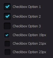
Checkbox. Checkboxes are pretty straightforward. Click once to set the Checkbox to On, click again to set it to Off. I have made a variety of different sizes
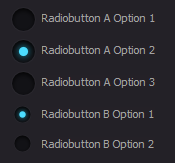
Radiobutton. Radiobuttons are a little more complicated in that they need to be Grouped to allow only one Radiobutton Option to be set as On per set of Radiobuttons. I have made a variety of different sizes; below you see 2 sets of Radiobuttons called Radiobutton A (set A) and Radiobutton B (set B)
Screen Shots
Carbon UI Elements

5 Star Rating. Add a Star Rating to your UserForm and capture the output of the user selection. The interactivity is a smooth scroll across all of the Stars until one is selected by a Mouse click. To undo or restart the process simply click the Mouse again

Rocker Switch. Add a Rocker Switch to your UserForm and capture the output of the On/Off action by the user. The interactivity is a simple Mouse click on either side of the Switch to depress it and change the action. In addition to this the Image will show either a bright Orange On action or a bright Blue Off action


Toggle Button. Add a Toggle Button to your UserForm and capture the output of the On/Off action by the user. The interactivity is a simple Mouse click on either side of the Switch to depress it and change the action. In addition to this the Image will show either a bright Orange On action or a bright Blue Off action


Slider Button. Add a Slider Button to your UserForm and capture a Range value ie. 1 to 100 set by the user as they drag the Slider. The interactivity is a beautifully smooth Grab and Drag using the Mouse on the main Button. A Drag to the left will set the Slider to its Minimum position and a Drag to the right will set the Slider to its Maximum position. The Toggle Button was exported out as a GIF Image so as to preserve its transparency and it was then loaded directly into the Image Control as opposed to loading via my Transparent Image Software included with this purchase/download

Buttons. The Buttons available in this Software act like normal Buttons with a MouseOver effect. A Button will display a different Image as the Mouse rolls over it and then you can make the Button 'do soomething' like close the UserForm. Another type of Button will depress, pause for a brief time in Milliseconds before 'doing something'. Finally I have added a Button that can be Pressed permanently or Pressed and then Unpressed again with its State stored in a Defined Name or Named Range. Here are the 4 Buttons in the Software each with slightly different interactivity

Checkbox. Checkboxes are pretty straightforward. Click once to set the Checkbox to On, click again to set it to Off. I have made a variety of different sizes

Radiobutton. Radiobuttons are a little more complicated in that they need to be Grouped to allow only one Radiobutton Option to be set as On per set of Radiobuttons. I have made a variety of different sizes; below you see 2 sets of Radiobuttons called Radiobutton A (set A) and Radiobutton B (set B)

FAQ
Q. Can I change the Images?
A. Of course -you can use your own. I recommend an art package like 'Affinity Designer' to create or edit SVG and PNG Images. Instructions on how to add your own Images to an Image Control with Transparency are in the 'ImageTransparency.xlsm' file included in the download. Don't forget you can just load an Image directly into an Image Control as a Transparent GIF!
Q. How do I change the Text on a Button?
A. Instructions are given in the Usage Section - you will need an Art Package like Paint Shop Pro, Photoshop or Affinity Designer to edit the original PSD file by Graphicsfuel.com (this is FREE but NOT included in the Software). Two additional Button Images are included in the Download file, the 'OK' and 'Cancel' Button Images
Videos
This is a video of the Carbon UI Elements in action. Music featured is 'Born a Rockstar - NEFFEX' · view the Carbon UI Elements video on YouTube
Caution: Music may contain Explicit Lyrics, please listen at your own risk!Support
Support is 100% optional and I provide it for your convenience, so please be patient, polite and respectful
Support for my Software
- Responding to questions or problems regarding the Software and its features
- Fixing valid (replicated) bugs and reported issues for the VERSION I HAVE WRITTEN
Software support does not include
- Customization and installation services
- Support for third party software or ANY kind of development whatsoever
Before seeking support
- Make sure your question is a valid Software Issue and not a customization request
- Make sure you have read through the FAQ's, online documentation and any related video guides before asking support on how to accomplish a task
- Ensure that you access to the VBOM is allowed and that Macros can run in Excel
- Make sure to provide 'proof of purchase' and state the name / version of the Software that you are having issues with when requesting support by Email or via Facebook
How to get Support
Contact Mark Kubiszyn on the Email address provided when you purchased the Software, including the Order Number
Remember to be patient, if there has been an issue with your download, Mark will always respond within 48 hours and will Email you the File directly if neccessary. For other issues the response time may be considerably longer and I may choose to respond to specific questions only (as is my right), depending on what has been asked
Future Builds
* No ideas as yet!
Bug Fixes
* No bugs have been identified for Carbon UI
Changelog
You can find the version history in the Code Module for any Macro-enabled Software or read more information on the status of each release here
- the latest Version including a description of any changes made is always shown first
20.02.2023 - (Version 1.1)
Added the 'MouseCursor.AddCursor IDC_HAND' Code to the Event Handlers to ensure that we only see the Hand Cusrsor whenever an Image Control has a Mouse Click
Moved one of the Checkboxes down 1 pixel; sometimes the Image Control Images can get distorted depending on their placement within the UserForm and I had not noticed that one Checkbox 'Tick' looked strange
Changed the Names of the Selected Radioubutton Event Handlers from 'Checked' to 'Selected' as the Code was not recognising them; no errors occurred, however events were not being fire and the Code was not working correctly
Renamed the UserForm Caption to "Carbon UI Interactive Elements for Excel v1.1"
06.02.2023 - (Version 1)
General release of Carbon UI or Carbon UI Elements