Pop
Version 2
Introduction
- Price : £2.95
- Purchase : Pop
- Software Name : Pop · Scalable Message Dialog UI with Lightbox - using Icons, Preloaders & Links
- Software Version : v 2
- Author : Mark Kubiszyn
- Website : Kubiszyn.co.uk/
- License : MIT License (MIT)
If you have already purchased this Software, let me take a moment to thank you for being a loyal customer
You are entitled to free lifetime updates for ALL future builds
This documentation is to help you understand the Software and to give you a more meaningful insight into what it can do. Please go through the documentation and read it carefully · Moderate to advanced VBA skills will be required
Requirements
You will need the following Excel Version & Prerequisite to use this Software
- Excel 2010, 2013 & 2016 Version 16.0 (32bit or 64bit) Office 365
- Moderate to advanced VBA
- Access to the VBOM (a setting in Excel) & Macro's must be enabled
- Windows PC · NOT a Mac!
To fuly develop this Software into your own Commercial Product or AddIn for Excel, HTML, CSS, JavaScript & Base64 Encoding Skills for Image manipulation amy also be required
No support is provided for customization or development of this Software
Pop Box with Success Thumb Up - please Note: this Thumb Icon is not included with Pop, but can be purchsed for $2 at www.iconfinder.com
Pop Box with Upload / Cloud - please Note: this Upload / Cloud Icon is not included with Pop, but can be purchsed for $2 at www.iconfinder.com
Preloader - Cogs:
Preloader - Ring:
Preloader - Harmony:
Preloader - Rolling:
About Pop #back to top
You are purchsing Pop version 2 featuring the latest fix for Windows 11 rounding and resizing of Windows
Please Note: from version 1.8, Pop has major changes to the CSS that effect the Horizontal and Vertical Alignment of Objects - manual positioning for all Horizontal Pop Objects must now be made - this is due to a recent Microsoft Windows 10 Update
Pop is a Scalable, Flexible, Bespoke Message Dialog UI for Excel built using VBA/HTML/Javascript/CSS in a WebBrowser Control, featuring Icons, Images, Text, Buttons, a Progressbar and Preloaders. It includes a Javascript Fade-out for the Dialog Box when closed by a Button or the small Close Cross. You can create Message Dialog Boxes, Progress Bars and Splash Screens using this Software. Pop comes packaged with lots of Icons and Images and features 139 Demos!

Pop, PopBox (or Pop.Box) for Excel, uses Boxes as containers for Text, Frames, Images, Icons, a Progressbar and its Buttons. You can build a Modal Dialog with LightBox and Timeout to display Messages, Alerts and Notifications to users. Pop is flexible with extensive configuration Settings to adjust everything from the Lightbox Colour and Fade, the Size of the Window and Icons (in Percentage %) through to the Style used for all of the Boxes, including the Backgrounds, Borders and Fonts
Each Box can be adjusted through the CSS Styles() Parameter, by passing a CSS string of Pipe '|' delimited values, for example:
"'canvas-box', {'border':'1px solid #3FC59D','width':'400px','height':'300px'} | "
Getting Started #back to top
The Zip download File
Unzip the Pop.zip File and open Pop.xlsm. Test all of the examples to see what Pop can do. Now take a copy of Pop.xlsm and use this to begin a New Project or see Copy Pop into an Existing Project (please follow this carefully - because of the methods used to embed Base64 images within a Worksheet, you cannot simply Export/Import the individual Excel Code Modules)
To launch Pop with a Blank Canvas:
Sub Example_Blank_Canvas()

    Pop.Init ScalePercentage:="0%"
    Pop.Box Canvas:=True

End Sub
The Pop Zip Files #back to top
Pop comes as a ZIP archive, meaning that you need to extract the Files before using the Software. You get 2 main Files featuring 1 Logo, 6 Preloaders and 18 Icons (or Images) that are embedded into the Msg Workbook - I also include any Files that are loaded into memory as the Base64 data in a TXT File. The first File is the main 'Pop.xlsm' File used to Copy into your Project, or to test and develop as your finished Software. The second File is 'Minified.xlsm' which is a Copy of the main Pop Code Modules whereupon I installed just the 'Camera' Icon - this is ready for deployment - see Copy Pop into an Existing Project
Copy Pop into an Existing Project #back to top
Unzip the Pop.zip File (right-click->Extract Files...). Open Pop.xlsm and your own Macro-enabled Project using the same instance of Excel (I am using a new Project called 'Test.xlsm' for this example). Press ALT+F11 to enter the VBA Editor, Expand all visible Nodes and in the Project Explorer Window, drag the UserForm Code Modules, 'frmLightBox' and 'frmPop' into your Project from the Pop.xlsm Project. Then Drag the 'Pop' and 'mdIcons' Code Modules into your Project (see the image below):

Now you have 2 choices. If you DON'T want to use all of the Icons that came with Pop.xlsm, then you can simply rename 'Sheet1' in the Code Module (or any Sheet) to 'shtPop' and in the 'Pop' Code Module, run the InstallIcons() subroutine to install just the Icons that you want. After this you are good to go!
If you do want to use all of the Icons that came with Pop.xlsm, then select Pop.xlsm and click on the 'Sheet1' Worksheet. Right-click on the 'Sheet1' Tab and choose 'Move or Copy...'. In the 'To Book' Dropdown Combo, select your Project, choose 'Before Sheet' and select the first Sheet Name in your Project. Important! - DO NOT CHECK 'Create a Copy' - you need to 'MOVE' the 'Sheet1' Worksheet otherwise the embedded Icons will not follow the Worksheet. Press the 'OK' Button
That's it, now you can add an Example to one of your Project Code Modules and run a Pop Box - you can also use the InstallIcons() Subroutine to install your own Icons - have fun
Tip: you can Copy the small snippet of Code that is in the 'ThisWorkbook' Code Module if you want Pop to run a dummy load of the UserForms on opening which is helpful in pre-caching and making the very first Pop Box that is displayed upon opening run even faster
Quick Guide for Using your own Icons #back to top
1. Pop only uses embedded Base64 Encoded Images that are dynamically extracted from the 'shtPop' Worksheet in the 'Pop.xlsm' Workbook. You can Delete and then Load in any number of Images. You must first Base64 encode the Image String for the images that you require (see some online links below) – you then need to Save these as .TXT Files as per the examples in the download when you purchased Pop
2 links to enable you do this can be found here:
Motobit
Base64Image
2. The Subroutine to Load in your Icons and Preloaders as Base64 encoded data into the 'shtPop' Worksheet can be found in the 'Pop' Code Module. It is called 'InstallIcons' and will allow you to Browse and locate all of your Base64 Images/Preloader Files which must be '.TXT' Files . The Name of the Icon or Preloader is derived from the Filename of your Base64 Encoded Text File ie. 'icoSpanner.txt'
Make a backup of 'Pop'. Ensure that you have saved your Base64 data correctly in Text Files with the Name of the File being the Name of the Icon or Preloader that you want to use ie. 'icoSpanner' for a Spanner Icon Image. Scroll down to the InstallIcons() Subroutine and run this Code - Browse and select your Files to install them. Now you would add the Named Argument including the Name of the Icon like this: 'Icon:=icoSpanner' or Picture:=icoSpanner' etc.
The 2 Text Files as examples can be downloaded below:
icoSearch.txt
ldrCogs.txt
Scaling Pop Boxes #back to top
The Scale Factor Named Argument allows you to dynamically resize all of the visible Boxes including the 'Canvas' Box and main Window Size by passing a Percentage as a String (the default is '0%', no Scaling). For example, passing "25%" will resize everything by one quarter. This is a required Parameter in the Init() Subroutine and must be set to "0%" wrapped in quotes, for example, 'ScalePercentage:="0%"'
You can also Scale individual Icons, Pictures & Images, which will over-ride the Scaling detailed above, by setting the appropriate Named Arguement in the Pop.Box Subroutine ie. IconSizePercentage:="100%" for the actual size or IconSizePercentage:="50%" to display it at half of its normal size
In Summary, the subtle, but crucial difference between Scaling the Dialog Box and Logos, Icons and Pictures
- Dialog Box, will Scale as a multiplier ie. '50%' means to Scale by a further 50% of its original Width/Height
- Logo, Icons & Picture, '50%' means to Scale as a percentage of its original Width/Height
Pop with Ring Preloader at 100% using 'ScalePercentage:="0%"'

Pop with Ring Preloader scaled down by a quarter of its size using 'ScalePercentage:="-25%"'

Pop with Ring Preloader scaled to double its size using 'ScalePercentage:="100%"'

Please Note: if you do not specify a Width and Height and just turn on the Canvas, the ScalePercentage is not applied
You can choose not to Scale Images by setting 'ScaleImages:=False' in the Pop.Init() Subroutine - see the Image below (these settings can still be over-ridden by using the CSS Styles() Parameter giving complete control over Images):

The Pop Placeholders #back to top
All Pop Boxes have a Placeholder - a chasing ants style line (without the animation - believe me, it's not easy to do in Javascript for IE7, I did try!). This is useful when you begin a new design. To turn the setting on, ensure that you have at least one or more Boxes set to True ie. 'Canvas:=True', 'TitleText:=True' in the Pop.Box() Function and then set 'Placeholders:=True' in the Pop.Init() Subroutine - you will see something like the Image below; and there you have it - no more staring at a Blank Canvas:

And here is an Image displaying all of the available Pop Boxes (it may look a little messy, but you can now differentiate the individual Boxes from one another. The Logo, Icon and Picture Boxes are coloured Red, the Title, Strapline, Message, Buttons, Progress Percentage and Progress Title are coloured turquoise, and the Canvas, Frames and Progressbar is coloured Yellow):

Please Note: the Icons, Images or Preloaders are not displayed because we have not set the Object Names ie. 'Logo:=icoCalendar'. When we do, they will be displayed inside the Placeholders as per the Image below (also note that they will not adhere to any kind of alignment if the area they occupy is smaller than the size of the Image! You can see below that the 'icoSearch' Icon makes a lovely fit because the Icon Placeholder size is larger than the actual Image so it can be centered both Horizontally and Vertically. By the way, the Frame and Buttons have coloured Backgrounds to emphasise the areas they occupy similar to the Buttons
Here is a Screen Shot of me building a 'Msg' emulation Dialog Box using the Placeholders to get my bearings in the design process - they are a great help/guide, I think my favourite bit of the entire Project!:

Alignment #back to top
All of the Pop Boxes have some kind of Horizontal and Vertical alignment to align Icons, Images, Preloaders and Text - they use a 'Fix' specifically designed to work with IE7 and can be set through '(Pop Box Name)-box' and '(Pop Box Name)-psuedo' via the CSS Styles() Function. The Horizontal alignment Parameters are 'left, right, center' and the Vertical alignment Parameters are 'top, middle, bottom'. Here are the default alignments by Pop Box (X, Y):
Logo: Left, Center

Icon: Center, Center

Picture: Center, Center

Title: Left, Center

Strapline: Left, Center

Message: Left, Top

Progress: Title Left, Center

Progress: Percentage Left, Center

Close Button: Center, Center

OK Button: Center, Center

Cancel Button: Center, Center
The Horizontal alignment is set through the CSS Styles() Function like this:
Styles:="'title-box', {'font-family':'Verdana','font-size':'12px','color':'#5E585F','text-align':'left','top':'-8px','left':'30px','width':'340px','padding':'0px','z-index':'99'}"
The Vertical alignment is set through the CSS Styles() Function like this:
Styles:="'title-psuedo', {'vertical-align':'bottom'}"
You can over-ride the fixed alignments by setting the 'position' as 'absolute' and then passing your own alignment Parameters into the JavaScript like this:
Styles:="'title-psuedo', {'position':'absolute','top':'15px','left':'15px','text-align':'left'}"
Please Note: Frame Boxes are the only Pop Boxes that do not use the IE7 fix to try to align both Horizontally and Vertically as they were not designed to hold Text, however should you want to use Text with a Frame Pop Box then you should simply set 'frame1-psuedo' with the required alignment Parameters and pass the text via the CSS PsuedoStyles() Function. Here is how you would do this:
' Pop.Init()
Styles:="'frame1-psuedo', {'top':'4px','left':'12px'}"
PsuedoStyles:="frame1-text|Some Text Value"

' Pop.Box()
Frame1:=True
Logo (Image) Box #back to top
The Logo (Image/Icon/Animated GIF) is used to display an Image at the top of the Pop Box alongside a Title if required. The Logo has both X and Y alignment, meaning you can specify both Horizontal and Vertical alignment in the CSS Styles() Parameter alongside many other TagName arguments via JavaScript like Width, Height, Font Colour/Size etc. The Image Size can be adjusted using the LogoSizePercentage Parameter (default "100%"), for example, 'LogoSizePercentage:="50%"' which would reduce the Image by half. The Logo Box needs to be turned on by setting 'Logo:=True' in the Pop.Box() Function
Please Note: alignment within the Pop Box will only work if the Box is bigger than the Image or Preloader being displayed - also check using 'Placeholders:=True' that the Image or Preloader is within the Canvas area
Title (Text) Box #back to top
Title (Text) Box
The Title Text is used to display a Message at the top of the Pop Box to accompany the Logo. The Title has both X and Y alignment, meaning you can specify both Horizontal and Vertical alignment in the CSS Styles() Parameter alongside many other TagName arguments via JavaScript like Width, Height, Font Colour/Size etc. A Title Box doesn't need to be turned on in the Pop.Box() Function, simply passing anything other than "" will display the Box ie. 'TitleText:="Configuring Setup"'
Strapline (Text) Box #back to top
Strapline (Text) Box
The Strapline Text is used to display a large heading in order to make a statement that stands out from the main Message or Dialog Title. The Strapline has both X and Y alignment, meaning you can specify both Horizontal and Vertical alignment in the CSS Styles() Parameter alongside many other TagName arguments via JavaScript like Width, Height, Font Colour/Size etc. You can have up to 2 lines of short Text - anything else will be cut off completely as the CSS overflow setting is set to 'hidden'. A Strapline Box doesn't need to be turned on in the Pop.Box() Function, simply passing anything other than "" will display the Box ie. 'TitleText:="Configuring Setup"'
Message (Text) Box #back to top
Message (Text) Box
The Message Text is used to display a long formatted Message to the user. The Message has both X and Y alignment, meaning you can specify both Horizontal and Vertical alignment in the CSS Styles() Parameter alongside many other TagName arguments via JavaScript like Width, Height, Font Colour/Size etc. A Message Box doesn't need to be turned on in the Pop.Box() Function, simply passing anything other than "" will display the Box ie. 'MessageText:="Configuring Setup"'
You can have up to as many lines of Text as you like until it is cut off completely as the CSS overflow setting is set to 'hidden'. You can use any kind of formatted HTML within reason ie. <b>, <u>, <span> etc. - remember to include the closing tags
A Message Box will Scale Fonts with the Scale set for the Dialog or you can over-ride the setting using the CSS Styles() Setting - see Scaling Pop Boxes
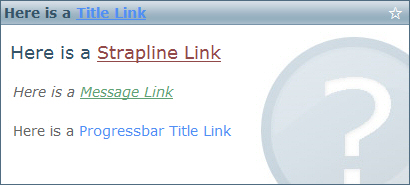
Link (Text) Box #back to top
Link (Text) Box
The Link Text is used to display a link, text and tooltip in order to provide a means of opening up a WebPage in an IE (Internet Explorer) Web Browser. The Link has both X and Y alignment, meaning you can specify both Horizontal and Vertical alignment in the CSS Styles() Parameter alongside many other TagName arguments via JavaScript like Width, Height, Font Colour/Size etc. A Link Box doesn't need to be turned on in the Pop.Box() Function, simply passing anything other than "" will display the Box ie. 'LinkTitle:="www.kubiszyn.co.uk"' and 'Link:="http\://www.kubiszyn.co.uk/|top=10,left=10,width=900,height=680,toolbar=yes,scrollbars=yes,resizable=yes,location=yes"' - both parts need to be passed in order to use the Link Pop Box
You can have multiple links when using Pop but only one Link Box. Links can be either Modal or Non-Modal, meaning that after clicking the link the WebPage opened up in the Browser will allow control back to the Excel Application or wait until the user closes the Browser before returning control. Links can be passed all manner of 'Switches' which are inbuilt as part of the JavaScript Calls to open the Windows - these will be parsed when they are passed into the Pop.Box() Parameters ie. 'scrollbars=yes,location=yes' meaning display the Scrollbars and the Location bar of the Web Browser Control when it is displayed after clicking a link. There is one more alternative method to add a Modal Link - see Psuedo Modal Link
In Summary - Links can be added to a Pop Box Dialog in one of two ways of a combination of both:
1. Use HTML in any of the Text Pop Boxes like TitleText, MessageText or ProgressbarTitleText
2. Use a dedicated Link Box for which you can also set the link 'Rollover' or 'Hover' Colours
Option 1 - Use HTML in any of the Text Pop Boxes like TitleText, MessageText or ProgressbarTitleText (notice the '\' Backslash to comment out all of the Apostrophe's and the use of the 'color' TagName to style the Font Colour):
LinkTitle:="www.kubiszyn.co.uk", _
ProgressbarTitleText:="<a href=\'http://www.kubiszyn.co.uk\' target=\'_blank\' title=\'visit kubiszyn.co.uk from a html link embedded in a pop box\' style=\'color:#518FF5 !important\'>www.kubiszyn.co.uk</a>"
Option 2 (i) Use a dedicated Link Box for which you can also set the link 'Rollover' or 'Hover' Colours (NON-MODAL):
LinkTitle:="www.kubiszyn.co.uk", _
Link:="http\://www.kubiszyn.co.uk/|top=10,left=10,width=900,height=680,toolbar=yes,scrollbars=yes,resizable=yes,location=yes"
Psuedo Modal Link #back to top
This is an alternative method of adding a link using Frames and HTML passed in the CSS Psuedo Style() Code
First of all, you need to set 'Pop.OpenWindowSettings' wiith the appropriate settings for when the Browser Window is opened like this:
Pop.OpenWindowSettings "dialogTop:10px;dialogLeft:10px;dialogWidth:900px;dialogHeight:680px;resizable:yes;status:yes;scroll:yes"
Next you need to pass in the required Parameters for the PsuedoStyles() Function. The first part is 'frame1-text', followed by a '|' Pipe and then the HTML Code which must include a call to 'PsuedoLink()' which is a JavaScript Function:
PsuedoStyles:="frame1-text|<a style='color:#4E485F !important; text-decoration:none' href='#' target='_blank' title='More Info' onclick=""PsuedoLink('http://www.kubiszyn.co.uk/documentation/pop.html'); return false;"">More Info</a>"
That's it - all being well, you should now have a Modal Browser Window Popup whenever the Dummy Button Text is clicked. Here is a Screen Shot:

Button Box #back to top
Pop can display Hover Buttons and capture their return values. 2 Buttons are available to use in Pop, an 'OK' Button and a 'Cancel' Button. A Button 'Text' has both X and Y alignment, meaning you can specify both Horizontal and Vertical alignment in the CSS Styles() Parameter alongside many other TagName arguments via JavaScript like Width, Height, Font Colour/Size etc. A Button needs to be turned on in the Pop.Box() Function ie. 'OKButton:=True' and 'CloseButton:=True'. Buttons use CSS PsuedoStyles() to change things like their Rollover, Rollout Background Colours and Font Colours, plus things like the Titles of the Tooltips when you hover over a Button
Just because the Button has a Name doesn't mean that you cannot use it for a different purpose, ie. you can use the 'OK' Button to have the Text Cancel and capture the return result. The 'OK' Button will always return 'vbYes' whereas the 'Cancel' Button will always return 'vbNo' and the Close Cross Click will always return 'vbCancel'. The default is set to be 'vbCancel' if you capture the result via a Lightbox Click. However if someone presses the 'Escape' Key you can check for 'vbAbort'
Buttons can have a 'Flat' look and feel about them by just using a Backgroound Colour or they can have cool 3D Borders effects applied ie. 'Ridge', 'Inset', 'Outset', Groove'. Here is a Pop Box with a nice 'Groove' effect and 'Thin' Border:

Here is the same Dialog with a 'Thin', 'Outset' Border:

Frame Box #back to top
Frames are used to hold Icons and Pictures or to draw a Border around Text or Images. Frames have Psuedo Rollover Background Colours. Frames can also be used as dividers between content
Progressbar Boxes #back to top
There are 3 parts to a Progressbar, the 'Progressbar' (and 'Progressbar Box), the 'ProgressbarTitleText' and the 'ProgressbarPercentageText'. The 'Progressbar' Box (progress-box) is the container for the 'Progressbar Box' (progressbar-box) and requires to be displayed using 'Progressbar:=True' in the Pop.Box() Function
The 'ProgressbarTitleText' is used to display Text alongside the Progressbar and can be used like this:
ProgressbarTitleText:="Press {Esc} to cancel the process"
The 'ProgressbarPercentageText' is used to display the actual Percentage value ie. "8%", "50%" or "100%". It can be used like this:
ProgressbarPercentageText:="0%"
All of these can be used in combination or in isolation to some extent depending on the result that you wish to achieve. You can also just use a normal 'Title' or 'Message' with a Progressbar. I have included extensive demonstrations of a whole variety of Progressbars running dummy tasks so that you get some idea of just how flexible the Code is
To use a Progressbar you must include a call to your Subroutine or Function by adding the Name of your Subroutine or Function to the 'Callback' Parameter in the Pop.Box() Function like this:
Callback:="Task7"
Then, in order that you can include a Progressbar whilst running a task, you need to use the 'CallbackUpdate()' Subroutine in conjunction with the 'Pop.Aborted()' Subroutine, passing the name of the 'Element' that you would like to update ie. a Message Box or a Title, like this (you will not neccessarily need to include all of these calls, this is just example Code to give you an idea, please see the examples that come with the Pop.xlsm download File):
If Pop.Aborted Then
 Pop.CallbackUpdate DialogElement:="message", UpdateValue:="Formatting Master data
Please wait...

- Process aborted..."
 Pop.Pause 3000
Else
 Pop.CallbackUpdate DialogElement:="title", UpdateValue:="Running Macro 100%"
 Pop.CallbackUpdate DialogElement:="message", UpdateValue:="Formatting Master data
Complete..."
 Pop.CallbackUpdate DialogElement:="progress-percentage-box", UpdateValue:=iVal
 Pop.CallbackUpdate DialogElement:="progressbar-box", UpdateValue:=iVal
 Pop.Pause 3000
End If
To exit whilst running a task you would use the 'Pop.CallbackExit()' Subroutine which will then ensure a smooth exit from a Pop Box Dialog
To build a Pause into any of your routines, you can use the 'Pop.Pause()' Subroutine like this:
Pop.Pause 3000
Close Cross Box #back to top
The Close Box (or Close Cross Box) is used to dismiss the Pop Box or Dialog. The Close Box has both X and Y alignment, meaning you can specify both Horizontal and Vertical alignment in the CSS Styles() Parameter alongside many other TagName arguments via JavaScript like Width, Height, Font Colour/Size etc. It is turned on by setting 'CloseButton:=True' in the Pop.Box() Function
The Close Box uses CSS PsuedoStyles() for Rollover/Rollout Background, Font Colours and Tooltip. It is not Text and is not an Image. It is displayed using a single HTML Code which can be changed via CSS PsuedoStyles() - the default HTML Code is '✖' or '✖'
If you don't like the Close Cross used or you fancy something different, then you can change this Symbol to (almost) anything you like that is represented by the HTML Code Table shown below
Here is the Code to change the Close Cross and display an alternative Tooltip using the '✗' symbol '✗'
PsuedoStyles:="ok-rollover-background|#DAE3E8,ok-rollout-background|#D0D9E0,ok-rollover-colour|#3E585F,ok-text|Okay,ok-title|Close the dialog," & _
              "close-rollout-colour|#666666,close-cross|✗,close-tooltip|Click this alternative close cross to close the dialog"
Here is a full Table listing of HTML Codes that you may be able to use depending on your system and how it interprets the Codes:
  Space
! ! Exclamation mark
" " " Double quote
# # # Pound (hash) symbol
$ $ $ Dollar
% % % Percent
& & & Ampersand
' ' ' Single quote
( ( ( Opening parenthesis
) ) ) Closing parenthesis
* * * Asterisk
+ + + Plus sign
, , , Comma
- - − Minus sign - Hyphen
. . . Period
/ / / Forward slash
0 0
1 1
2 2
3 3
4 4
5 5
6 6
7 7
8 8
9 9
: : : Colon
; ; ; Semicolon
< < < Less than sign
= = = Equal sign
> > > Greater than sign
? ? ? Question mark
@ @ @ At symbol
A A
B B
C C
D D
E E
F F
G G
H H
I I
J J
K K
L L
M M
N N
O O
P P
Q Q
R R
S S
T T
U U
V V
W W
X X
Y Y
Z Z
[ [ [ Opening bracket
\ \ \ Backslash
] ] ] Closing bracket
^ ^ ^ Caret - circumflex
_ _ _ Underscore
` ` ` Grave accent
a a
b b
c c
d d
e e
f f
g g
h h
i i
j j
k k
l l
m m
n n
o o
p p
q q
r r
s s
t t
u u
v v
w w
x x
y y
z z
{ { { Opening brace
| | | Vertical bar
} } } Closing brace
~ ~ Equivalency sign - tilde
  Non-breaking space
¡ ¡ ¡ Inverted exclamation mark
¢ ¢ ¢ Cent sign
£ £ £ Pound sign
¤ ¤ ¤ Currency sign
¥ ¥ ¥ Yen sign
¦ ¦ ¦ Broken vertical bar
§ § § Section sign
¨ ¨ ¨ Spacing diaeresis - umlaut
© © © Copyright sign
ª ª ª Feminine ordinal indicator
« « « Left double angle quotes
¬ ¬ ¬ Not sign
­ ­ Soft hyphen
® ® ® Registered trade mark sign
¯ ¯ ¯ Spacing macron - overline
° ° ° Degree sign
± ± ± Plus-or-minus sign
² ² ² Superscript two - squared
³ ³ ³ Superscript three - cubed
´ ´ ´ Acute accent - spacing acute
µ µ µ Micro sign
¶ ¶ ¶ Pilcrow sign - paragraph sign
· · · Middle dot - Georgian comma
¸ ¸ ¸ Spacing cedilla
¹ ¹ ¹ Superscript one
º º º Masculine ordinal indicator
» » » Right double angle quotes
¿ ¿ ¿ Inverted question mark
× × × Multiplication sign
÷ ÷ ÷ Division sign
À À À Latin capital letter A with grave
Á Á Á Latin capital letter A with acute
#N/A
à à à Latin capital letter A with tilde
Ä Ä Ä Latin capital letter A with diaeresis
Å Å Å Latin capital letter A with ring above
Æ Æ Æ Latin capital letter AE
Ç Ç Ç Latin capital letter C with cedilla
È È È Latin capital letter E with grave
É É É Latin capital letter E with acute
Ê Ê Ê Latin capital letter E with circumflex
Ë Ë Ë Latin capital letter E with diaeresis
Ì Ì Ì Latin capital letter I with grave
Í Í Í Latin capital letter I with acute
Î Î Î Latin capital letter I with circumflex
Ï Ï Ï Latin capital letter I with diaeresis
Ð Ð Ð Latin capital letter ETH
Ñ Ñ Ñ Latin capital letter N with tilde
Ò Ò Ò Latin capital letter O with grave
Ó Ó Ó Latin capital letter O with acute
Ô Ô Ô Latin capital letter O with circumflex
Õ Õ Õ Latin capital letter O with tilde
Ö Ö Ö Latin capital letter O with diaeresis
Ø Ø Ø Latin capital letter O with slash
Ù Ù Ù Latin capital letter U with grave
Ú Ú Ú Latin capital letter U with acute
Û Û Û Latin capital letter U with circumflex
Ü Ü Ü Latin capital letter U with diaeresis
Ý Ý Ý Latin capital letter Y with acute
Þ Þ Þ Latin capital letter THORN
ß ß ß Latin small letter sharp s - ess-zed
à à à Latin small letter a with grave
á á á Latin small letter a with acute
â â â Latin small letter a with circumflex
ã ã ã Latin small letter a with tilde
ä ä ä Latin small letter a with diaeresis
å å å Latin small letter a with ring above
æ æ æ Latin small letter ae
ç ç ç Latin small letter c with cedilla
è è è Latin small letter e with grave
é é é Latin small letter e with acute
ê ê ê Latin small letter e with circumflex
ë ë ë Latin small letter e with diaeresis
ì ì ì Latin small letter i with grave
í í í Latin small letter i with acute
î î î Latin small letter i with circumflex
ï ï ï Latin small letter i with diaeresis
ð ð ð Latin small letter eth
ñ ñ ñ Latin small letter n with tilde
ò ò ò Latin small letter o with grave
ó ó ó Latin small letter o with acute
ô ô ô Latin small letter o with circumflex
õ õ õ Latin small letter o with tilde
ö ö ö Latin small letter o with diaeresis
ø ø ø Latin small letter o with slash
ù ù ù Latin small letter u with grave
ú ú ú Latin small letter u with acute
û û û Latin small letter u with circumflex
ü ü ü Latin small letter u with diaeresis
ý ý ý Latin small letter y with acute
þ þ þ Latin small letter thorn
ÿ ÿ ÿ Latin small letter y with diaeresis
ΠΠΠLatin capital letter OE
œ œ œ Latin small letter oe
Š Š Š Latin capital letter S with caron
š š š Latin small letter s with caron
Ÿ Ÿ Ÿ Latin capital letter Y with diaeresis
ƒ ƒ ƒ Latin small f with hook - function
Α Α Α Greek capital letter alpha
Β Β Β Greek capital letter beta
Γ Γ Γ Greek capital letter gamma
Δ Δ Δ Greek capital letter delta
Ε Ε Ε Greek capital letter epsilon
Ζ Ζ Ζ Greek capital letter zeta
Η Η Η Greek capital letter eta
Θ Θ Θ Greek capital letter theta
Ι Ι Ι Greek capital letter iota
Κ Κ Κ Greek capital letter kappa
Λ Λ Λ Greek capital letter lambda
Μ Μ Μ Greek capital letter mu
Ν Ν Ν Greek capital letter nu
Ξ Ξ Ξ Greek capital letter xi
Ο Ο Ο Greek capital letter omicron
Π Π Π Greek capital letter pi
Ρ Ρ Ρ Greek capital letter rho
Σ Σ Σ Greek capital letter sigma
Τ Τ Τ Greek capital letter tau
Υ Υ Υ Greek capital letter upsilon
Φ Φ Φ Greek capital letter phi
Χ Χ Χ Greek capital letter sigma
Ψ Ψ Ψ Greek capital letter psi
Ω Ω Ω Greek capital letter omega
α α α Greek small letter alpha
β β β Greek small letter beta
γ γ γ Greek small letter gamma
δ δ δ Greek small letter delta
ε ε ε Greek small letter epsilon
ζ ζ ζ Greek small letter zeta
η η η Greek small letter eta
θ θ θ Greek small letter theta
ι ι ι Greek small letter iota
κ κ κ Greek small letter kappa
λ λ λ Greek small letter lambda
μ μ μ Greek small letter mu
ν ν ν Greek small letter nu
ξ ξ ξ Greek small letter xi
ο ο ο Greek small letter omicron
π π π Greek small letter pi
ρ ρ ρ Greek small letter rho
ς ς ς Greek small letter final sigma
σ σ σ Greek small letter sigma
τ τ τ Greek small letter tau
υ υ υ Greek small letter upsilon
φ φ φ Greek small letter phi
χ χ χ Greek small letter chi
ψ ψ ψ Greek small letter psi
ω ω ω Greek small letter omega
ϑ ϑ ϑ Greek small letter theta symbol
ϒ ϒ ϒ Greek upsilon with hook symbol
ϖ ϖ ϖ Greek pi symbol
– – – En dash
— — — Em dash
‘ ‘ ‘ Left single quotation mark
’ ’ ’ Right single quotation mark
‚ ‚ ‚ Single low-9 quotation mark
“ “ “ Left double quotation mark
” ” ” Right double quotation mark
„ „ „ Double low-9 quotation mark
† † † Dagger
‡ ‡ ‡ Double dagger
• • • Bullet
… … … Horizontal ellipsis
‰ ‰ ‰ Per thousand sign
‱ ‱ Per thousand sign
※ ※ Komejirushi
‼ ‼ Double exclamation mark
‽ ‽ Exclamation question
‾ ‾ ‾ Overline, a.k.a. spacing overscore
⁁ ⁁ Caret Insertion Point
⁂ ⁂ Asterism
⁇ ⁇ Double question
⁈ ⁈ Question Exclamation
⁉ ⁉ Exclamation Question
⁑ ⁑ Double asterisk
€ € € Euro sign
™ ™ ™ Trade mark sign
∀ ∀ ∀ For all
❝ ❝ Heavy double turned comma quotation mark ornament
❞ ❞ Heavy double comma quotation mark ornament
∂ ∂ ∂ Partial differential
∃ ∃ ∃ There exists
∅ ∅ ∅ Empty set, null set, diameter
∇ ∇ ∇ Nabla, backward difference
∈ ∈ ∈ Element of
∉ ∉ ∉ Not an element of
∋ ∋ ∋ Contains as member
∏ ∏ ∏ n-ary product
∑ ∑ ∑ n-ary sumation
− − − Minus sign
∓ ∓ Minus-or-plus sign
∔ ∔ Dot plus
∕ ∕ Division slash
∖ ∖ Set minus
∗ ∗ ∗ Asterisk operator
√ √ √ Square root
∛ ∛ Cube Root
∜ ∜ Root
∝ ∝ ∝ Proportional to
∞ ∞ ∞ Infinity
∠ ∠ ∠ Angle
∧ ∧ ∧ Logical AND, or wedge
∩ ∩ ∩ Intersection, or cap
∪ ∪ ∪ Union, or cup
∫ ∫ ∫ Integral
∬ ∬ Double integral
∭ ∭ Triple integral
∮ ∮ Line integral
∯ ∯ Double line integral
∰ ∰ Triple line integral
∴ ∴ ∴ Therefore
∵ ∵ Because sign
∶ ∶ Ratio
∷ ∷ Proportion
∻ ∻ Homothetic preferences
∼ ∼ ∼ Tilde operator, or varies with
∽ ∽ Approximation
≀ ≀ Wreath product
≅ ≅ ≅ Approximately equal to
≈ ≈ ≈ Almost equal to, asymptotic to
≠ ≠ ≠ Not equal to
≡ ≡ ≡ Identical to
≤ ≤ ≤ Less-than or equal to
≥ ≥ ≥ Greater-than or equal to
⊂ ⊂ ⊂ Subset of
⊃ ⊃ ⊃ Superset of
⊄ ⊄ ⊄ Not a subset of
⊆ ⊆ ⊆ Subset of or equal to
⊇ ⊇ ⊇ Superset of or equal to
⊕ ⊕ ⊕ Circled plus, direct sum
⊖ ⊖ Circled minus
⊗ ⊗ ⊗ Circled times, vector product
⊘ ⊘ Circled divide
⊙ ⊙ Circled dot
⊚ ⊚ Circled circle
⊛ ⊛ Circled asterisk
⊜ ⊜ Circled equals
⊝ ⊝ Circled minus
⊥ ⊥ ⊥ Up tack, orthogonal to, perpendicular
⊦ ⊦ ∨ Logical OR, or vee
⋅ ⋅ ⋅ Dot operator
⌈ ⌈ ⌈ Left ceiling, a.k.a. apl upstile
⌉ ⌉ ⌉ Right ceiling
⌊ ⌊ ⌊ Left floor, apl downstile
⌋ ⌋ ⌋ Right floor
▪ ▪ Black small square
◉ ◉ Fisheye
◊ ◊ ◊ Lozenge
○ ○ White circle
◎ ◎ Bullseye
☆ ☆ White 5 point star
¼ ¼ ¼ Fraction one quarter
½ ½ ½ Fraction one half
¾ ¾ ¾ Fraction three quarters
⅕ ⅕ Fraction one fifth
⅖ ⅖ Fraction two fifths
⅗ ⅗ Fraction three fifths
⅘ ⅘ Fraction four fifths
⅙ ⅙ Fraction one sixth
⅚ ⅚ Fraction five sixths
⅛ ⅛ Fraction one eighth
⅜ ⅜ Fraction three eighths
⅝ ⅝ Fraction five eighths
⅞ ⅞ Fraction seven eighths
← ← ← Leftwards arrow
↑ ↑ ↑ Upwards arrow
→ → → Rightwards arrow
↓ ↓ ↓ Downwards arrow
↔ ↔ ↔ Left right arrow
↕ ↕ Up down arrow
↖ ↖ North west arrow
↗ ↗ North east arrow
↘ ↘ South east arrow
↙ ↙ South west arrow
↚ ↚ Leftwards arrow with stroke
↛ ↛ Rightwards arrow with stroke
↜ ↜ Leftwards wave arrow
↝ ↝ Rightwards wave arrow
↞ ↞ Leftwards two headed arrow
↟ ↟ Upwards two headed arrow
↠ ↠ Rightwards two headed arrow
↡ ↡ Downwards two headed arrow
↢ ↢ Leftwards arrow with tail
↣ ↣ Rightwards arrow with tail
↤ ↤ Leftwards arrow from bar
↥ ↥ Upwards arrow from bar
↦ ↦ Downwards arrow from bar
↨ ↨ Up down arrow with base
↩ ↩ Leftwards arrow with hook
↪ ↪ Rightwards arrow with hook
↫ ↫ Leftwards arrow with loop
↬ ↬ Rightwards arrow with loop
↭ ↭ Left right wave arrow
↮ ↮ Left right arrow with stroke
↯ ↯ Downwards zigzag arrow
↰ ↰ Upwards arrow with tip leftwards
↱ ↱ Upwards arrow with tip rightwards
↲ ↲ Downwards arrow with tip leftwards
↳ ↳ Downwards arrow with tip rightwards
↴ ↴ Rightwards arrow with corner downwards
↵ ↵ ↵ Downwards arrow with corner leftwards
↶ ↶ Anticlockwise top semicircle arrow
↷ ↷ Clockwise top semicircle arrow
↸ ↸ North west arrow to long bar
↹ ↹ Leftwards arrow to bar over rightwards arrow to bar
↺ ↺ Anticlockwise open circle arrow
↻ ↻ Clockwise open circle arrow
↼ ↼ Leftwards harpoon with barb upwards
↽ ↽ Leftwards harpoon with barb downwards
↾ ↾ Upwards harpoon with barb rightwards
↿ ↿ Upwards harpoon with barb leftwards
⇀ ⇀ Rightwards harpoon with barb upwards
⇁ ⇁ Rightwards harpoon with barb downwards
⇂ ⇂ Downwards harpoon with barb rightwards
⇃ ⇃ Downwards harpoon with barb leftwards
⇄ ⇄ Rightwards arrow over leftwards arrow
⇅ ⇅ Upwards arrow leftwards of downwards arrow
⇆ ⇆ Leftwards arrow over rightwards arrow
⇇ ⇇ Leftwards paired arrows
⇈ ⇈ Upwards paired arrows
⇉ ⇉ Rightwards paired arrows
⇊ ⇊ Downwards paired arrows
⇋ ⇋ Leftwards harpoon over rightwards harpoon
⇌ ⇌ Rightwards harpoon over leftwards harpoon
⇍ ⇍ Leftwards double arrow with stroke
⇎ ⇎ Left right double arrow with stroke
⇏ ⇏ Rightwards double arrow with stroke
⇐ ⇐ ⇐ Leftwards double arrow
⇑ ⇑ ⇑ Upwards double arrow
⇒ ⇒ ⇒ Rightwards double arrow
⇓ ⇓ ⇓ Downwards double arrow
⇔ ⇔ ⇔ Left right double arrow
⇕ ⇕ Up down double arrow
⇖ ⇖ North west double arrow
⇗ ⇗ North east double arrow
⇘ ⇘ South east double arrow
⇙ ⇙ South west double arrow
⇚ ⇚ Leftwards triple arrow
⇛ ⇛ Rightwards triple arrow
⇜ ⇜ Leftwards squiggle arrow
⇝ ⇝ Rightwards squiggle arrow
⇞ ⇞ Upwards arrow with double stroke
⇟ ⇟ Downwards arrow with double stroke
⇠ ⇠ Leftwards dashed arrow
⇡ ⇡ Upwards dashed arrow
⇢ ⇢ Rightwards dashed arrow
⇣ ⇣ Downwards dashed arrow
⇤ ⇤ Leftwards arrow to bar
⇥ ⇥ Rightwards arrow to bar
⇦ ⇦ Leftwards white arrow
⇧ ⇧ Upwards white arrow
⇨ ⇨ Rightwards white arrow
⇩ ⇩ Downwards white arrow
➘ ➘ Heavy south east arrow
➙ ➙ Heavy rightwards arrow
➚ ➚ Heavy north east arrow
➛ ➛ Drafting point rightwards arrow
➜ ➜ Heavy round-tipped rightwards arrow
➝ ➝ Triangle-headed rightwards arrow
➞ ➞ Heavy triangle-headed rightwards arrow
➟ ➟ Dashed triangle-headed rightwards arrow
➠ ➠ Heavy dashed triangle-headed rightwards arrow
➡ ➡ Black rightwards arrow
➢ ➢ Three-d top-lighted rightwards arrowhead
➣ ➣ Three-d bottom-lighted rightwards arrowhead
➤ ➤ Black rightwards arrowhead
➥ ➥ Heavy black curved upwards and rightwards arrow
➧ ➧ Squat black rightwards arrow
➨ ➨ Heavy concave-pointed black rightwards arrow
➩ ➩ Right-shaded white rightwards arrow
➪ ➪ Left-shaded white rightwards arrow
➫ ➫ Back-tilted shadowed white rightwards arrow
➬ ➬ Front-tilted shadowed white rightwards arrow
➭ ➭ Heavy lower right-shadowed white rightwards arrow
➮ ➮ Heavy upper right-shadowed white rightwards arrow
➯ ➯ Notched lower right-shadowed white rightwards arrow
➱ ➱ Notched upper right-shadowed white rightwards arrow
➲ ➲ Circled heavy white rightwards arrow
➳ ➳ White-feathered rightwards arrow
➴ ➴ Black-feathered south east arrow
➵ ➵ Black-feathered rightwards arrow
➶ ➶ Black-feathered north east arrow
➷ ➷ Heavy black-feathered south east arrow
➸ ➸ Heavy black-feathered rightwards arrow
➹ ➹ Heavy black-feathered north east arrow
➺ ➺ Teardrop-barbed rightwards arrow
➻ ➻ Heavy teardrop-shanked rightwards arrow
➼ ➼ Wedge-tailed rightwards arrow
➽ ➽ Heavy wedge-tailed rightwards arrow
➾ ➾ Open-outlined rightwards arrow
⋆ ⋆ 5 point star
★ ★ Black 5 point star
⚝ ⚝ Outlined white star
⛤ ⛤
⛥ ⛥
⛦ ⛦
⛧ ⛧
✢ ✢ Four teardrop-spoked asterisk
✣ ✣ Four balloon-spoked asterisk
✤ ✤ Heavy four balloon-spoked asterisk
✥ ✥ Four club-spoked asterisk
✦ ✦ Black four pointed star
✧ ✧ White four pointed star
✨ ✨
✩ ✩ Stress outlined white star
✪ ✪ Circled white star
✫ ✫ Open centre black star
✬ ✬ Black centre white star
✭ ✭ Outlined black star
✮ ✮ Heavy outlined black star
✯ ✯ Pinwheel star
✰ ✰ Shadowed white star
✱ ✱ Heavy asterisk
✲ ✲ Open centre asterisk
✳ ✳ Eight spoked asterisk
✴ ✴ Eight pointed black star
✵ ✵ Eight pointed pinwheel star
✶ ✶ Six pointed black star
✷ ✷ Heavy eight pointed rectilinear black star
✹ ✹ Twelve pointed black star
✺ ✺ Sixteen pointed asterisk
✻ ✻ Teardrop-spoked asterisk
✼ ✼ Open centre teardrop-spoked asterisk
✽ ✽ Heavy teardrop-spoked asterisk
✾ ✾ Six petalled black and white florette
❂ ❂ Circled open centre eight pointed star
❃ ❃ Heavy teardrop-spoked pinwheel asterisk
❅ ❅ Tight trifoliate snowflake
❆ ❆ Heavy chevron snowflake
❇ ❇ Sparkle
❈ ❈ Heavy sparkle
❉ ❉ Balloon-spoked asterisk
❊ ❊ Eight teardrop-spoked propeller asterisk
❋ ❋ Heavy eight teardrop-spoked propeller asterisk
❢ ❢ Heart Exclamation Mark
❣ ❣ Exclamation Heart
❤ ❤ Big Heart
❥ ❥ Rotated Heart
❦ ❦ Floral Heart
❧ ❧ Floral Heart Rotated
💓 💓 Heart Pulse
💔 💔 Broken Heart
💕 💕 Heart Couple
💖 💖 Heart Stars
💗 💗 Hearts
💘 💘 Heart with Arrow
💙 💙 Blue Heart
💚 💚 Green Heart
💛 💛 Yellow Heart
💜 💜 Purple Heart
💝 💝 Heart with Ribbon
💞 💞 Hearts Together
♥ ♥ Black Heart
♡ ♡ Red Heart
♈ ♈ Aries
♉ ♉ Taurus
♊ ♊ Gemini
♋ ♋ Cancer
♌ ♌ Leo
♍ ♍ Virgo
♎ ♎ Libra
♏ ♏ Scorpio
♐ ♐ Sagittarius
♑ ♑ Capricorn
♒ ♒ Aquarius
♓ ♓ Pisces
♔ ♔ White chess king
♕ ♕ White chess queen
♖ ♖ White chess rook
♗ ♗ White chess bishop
♘ ♘ White chess knight
♙ ♙ White chess pawn
♚ ♚ Black chess king
♛ ♛ Black chess queen
♜ ♜ Black chess rook
♝ ♝ Black chess bishop
♞ ♞ Black chess knight
♟ ♟ Black chess pawn
♠ ♠ ♠ Black Spade suit
♡ ♡ White Heart suit, valentine
♢ ♢ White Diamond suit
♣ ♣ ♣ Black Club suit, shamrock
♤ ♤ White Spade suit
♥ ♥ ♥ Black Heart suit, valentine
♦ ♦ ♦ Black Diamond suit
♧ ♧ White Club suit, shamrock
⚀ ⚀ Die 1
⚁ ⚁ Die 2
⚂ ⚂ Die 3
⚃ ⚃ Die 4
⚄ ⚄ Die 5
⚅ ⚅ Die 6
⚽ ⚽
⚾ ⚾
⛷ ⛷
⛸ ⛸
⛹ ⛹
① ① Circled digit one
② ② Circled digit two
③ ③ Circled digit three
④ ④ Circled digit four
⑤ ⑤ Circled digit five
⑥ ⑥ Circled digit six
⑦ ⑦ Circled digit seven
⑧ ⑧ Circled digit eight
⑨ ⑨ Circled digit nine
⑩ ⑩ Circled number ten
⑪ ⑪ Circled number eleven
⑫ ⑫ Circled number twelve
⑬ ⑬ Circled number thirteen
⑭ ⑭ Circled number fourteen
⑮ ⑮ Circled number fifteen
⑯ ⑯ Circled number sixteen
⑰ ⑰ Circled number seventeen
⑱ ⑱ Circled number eighteen
⑲ ⑲ Circled number nineteen
⑳ ⑳ Circled number twenty
⑴ ⑴ Parenthesized digit one
⑵ ⑵ Parenthesized digit two
⑶ ⑶ Parenthesized digit three
⑷ ⑷ Parenthesized digit four
⑸ ⑸ Parenthesized digit five
⑹ ⑹ Parenthesized digit six
⑺ ⑺ Parenthesized digit seven
⑻ ⑻ Parenthesized digit eight
⑼ ⑼ Parenthesized digit nine
⑽ ⑽ Parenthesized number ten
⑾ ⑾ Parenthesized number eleven
⑿ ⑿ Parenthesized number twelve
⒀ ⒀ Parenthesized number thirteen
⒁ ⒁ Parenthesized number fourteen
⒂ ⒂ Parenthesized number fifteen
⒃ ⒃ Parenthesized number sixteen
⒄ ⒄ Parenthesized number seventeen
⒅ ⒅ Parenthesized number eighteen
⒆ ⒆ Parenthesized number nineteen
⒇ ⒇ Parenthesized number twenty
⒈ ⒈ Digit one full stop
⒉ ⒉ Digit two full stop
⒊ ⒊ Digit three full stop
⒋ ⒋ Digit four full stop
⒌ ⒌ Digit five full stop
⒍ ⒍ Digit six full stop
⒎ ⒎ Digit seven full stop
⒏ ⒏ Digit eight full stop
⒐ ⒐ Digit nine full stop
⒑ ⒑ Number ten full stop
⒒ ⒒ Number eleven full stop
⒓ ⒓ Number twelve full stop
⒔ ⒔ Number thirteen full stop
⒕ ⒕ Number fourteen full stop
⒖ ⒖ Number fifteen full stop
⒗ ⒗ Number sixteen full stop
⒘ ⒘ Number seventeen full stop
⒙ ⒙ Number eighteen full stop
⒚ ⒚ Number nineteen full stop
⒛ ⒛ Number twenty full stop
⓪ ⓪ Circled digit zero
⓫ ⓫ Dingbat negative circled number evelven
⓬ ⓬ Dingbat negative circled number twelve
⓭ ⓭ Dingbat negative circled number thirteen
⓮ ⓮ Dingbat negative circled number fourteen
⓯ ⓯ Dingbat negative circled number fifteen
⓰ ⓰ Dingbat negative circled number sixteen
⓱ ⓱ Dingbat negative circled number seventeen
⓲ ⓲ Dingbat negative circled number eighteen
⓳ ⓳ Dingbat negative circled number nineteen
⓴ ⓴ Dingbat negative circled number twenty
❶ ❶ Dingbat negative circled digit one
❷ ❷ Dingbat negative circled digit two
❸ ❸ Dingbat negative circled digit three
❹ ❹ Dingbat negative circled digit four
❺ ❺ Dingbat negative circled digit five
❻ ❻ Dingbat negative circled digit six
❼ ❼ Dingbat negative circled digit seven
❽ ❽ Dingbat negative circled digit eight
❾ ❾ Dingbat negative circled digit nine
❿ ❿ Dingbat negative circled number ten
֍ ֍ Right facing Armenian eternity sign
֎ ֎ Left facing Armenian eternity sign
ॐ ॐ Devanagari Om
☤ ☤ Caduceus
☥ ☥ Ankh
☦ ☦ Orthodox cross
☧ ☧ Chi Rho
☨ ☨ Cross of Lorraine
☩ ☩ Cross of Jerusalem
☪ ☪ Star and Crescent
☫ ☫ Farsi Symbol
☬ ☬ Adi Shakti
☭ ☭ Hammer and Sickle
☮ ☮ Peace Symbol
☯ ☯ Yin Yang
☸ ☸ Wheel of Dharma
✝ ✝ Latin cross
✞ ✞ Shadowed white Latin cross
✟ ✟ Outlined Latin Cross
✠ ✠ Maltese cross
✡ ✡ Star of David
♩ ♩ Crotchet / Quarter note
♪ ♪ Quaver / Eighth note
♫ ♫ Quaver
♬ ♬ Double Quaver
♭ ♭ Flat note
♮ ♮ Natural Note
♯ ♯ Sharp Note
🎹 🎹 Keyboard
🎼 🎼 Score
࠽ ࠽ Degree fahrenheit sign
℃ ℃ Degrees Celsius
⌘ ⌘ Place of interest sign
⌚ ⌚ Watch
⌛ ⌛ Egg timer
⌧ ⌧ X in a rectangle box
⌨ ⌨ Keyboard
⌬ ⌬ Benzine ring
⍓ ⍓ APL functional symbol quad up caret
■ ■ Black square
□ □ White square
▯ ▯ White vertical rectangle
◆ ◆ Black diamond
● ● Black circle
☀ ☀ Black sun with rays
☁ ☁ Cloud
☂ ☂ Umbrella
☃ ☃ Snowman
☄ ☄ Comet
☎ ☎ Black telephone
☏ ☏ White telephone
☑ ☑ Ballot box with check
☒ ☒ Ballot box with X
☘ ☘ Clover
☠ ☠ Skull and crossbones
☢ ☢ Radioactive sign
☣ ☣ Biohazard sign
☹ ☹ White frowning face
☺ ☺ White smiling face
☼ ☼ White sun with rays
☽ ☽ First quarter moon
☾ ☾ Last quarter moon
☿ ☿ Mercury
♀ ♀ Female sign
♁ ♁ Earth
♂ ♂ Male sign
♨ ♨ Hot springs
♲ ♲ Recycle
♻ ♻ Recycle
♼ ♼ Recycle
♽ ♽ Recycle
♿ ♿ Disability
⚒ ⚒ Hammers
⚓ ⚓ Anchor
⚔ ⚔ Duelling Swords
⚕ ⚕ Staff of aesculapius
⚖ ⚖ Scales
⚘ ⚘ Flower
⚙ ⚙ Gear
⚚ ⚚ Staff of hermes
⚛ ⚛ Atomic
⚜ ⚜ Fleur-de-lis
⚞ ⚞ Three lines converging right
⚟ ⚟ Three lines converging left
⚠ ⚠ Caution
⚡ ⚡ Electricity
⚢ ⚢
⚣ ⚣
⚤ ⚤
⚥ ⚥
⚦ ⚦
⚧ ⚧
⚨ ⚨
⚩ ⚩
⚰ ⚰
⚱ ⚱
⚲ ⚲
⚳ ⚳
⚴ ⚴
⚵ ⚵
⛄ ⛄
⛟ ⛟
⛱ ⛱
⛲ ⛲
⛳ ⛳
⛴ ⛴
⛵ ⛵
✀ ✀
✁ ✁ Upper blade scissors
✂ ✂ Black scissors
✃ ✃ Lower blade scissors
✄ ✄
✆ ✆ Telephone location sign
✈ ✈ Airplane
✉ ✉ Envelope
✊ ✊
✋ ✋
✌ ✌ Victory hand
✍ ✍ Writing hand
✎ ✎ Lower Right Pencil
✏ ✏ Pencil
✐ ✐ Upper Right Pencil
✓ ✓ Check mark
✔ ✔
✕ ✕
✖ ✖
✗ ✗ Ballot X
✘ ✘
✿ ✿ Black florette
❀ ❀ White florette
❁ ❁ Eight petalled outlined black florette
❄ ❄ Snowflake
❍ ❍ Shadowed white circle
❏ ❏ Lower right drop shadowed white square
❐ ❐ Upper right drop shadowed white square
❑ ❑ Lower right shadowed white square
❒ ❒ Upper right shadowed white square
❖ ❖ Black diamond minus white X
⧫ ⧫ Black lozenge
⬧ ⬧ Black medium lozenge
🔒 🔒 Padlock
₠ ₠ Euro-currency sign
₡ ₡ Cent sign
₤ ₤ Pound sterling
㍱ ㍱ Hectopascal
㍲ ㍲ Dalton (atomic mass)
㍳ ㍳ Astronomical Unit
㍴ ㍴ Bar (Pressure)
㍵ ㍵
㍶ ㍶ Parsec
㎀ ㎀ Pico Amps
㎁ ㎁ Nano Amps
㎂ ㎂ Micro Amps
㎃ ㎃ Mega Amps
㎄ ㎄ Kilo Amps
㎅ ㎅ Kilobyte
㎆ ㎆ Megabyte
㎇ ㎇ Gigabyte
㎈ ㎈ Calories
㎉ ㎉ Kilocalories
㎊ ㎊ Pico Farads
㎋ ㎋ Nano Farads
㎌ ㎌ Micro Farads
㎍ ㎍ Micro Grams
㎎ ㎎ Miligrams
㎏ ㎏ Kilograms
㎐ ㎐ Hertz
㎑ ㎑ Kilohertz
㎒ ㎒ Megahertz
㎓ ㎓ Gigahertz
㎔ ㎔ Terahertz
㎕ ㎕ Micro litres
㎖ ㎖ Mililitres
㎗ ㎗ Decilitres
㎘ ㎘ Kilolitres
㎙ ㎙ Femtometre
㎚ ㎚ Nanometre
㎛ ㎛ Micrometre
㎜ ㎜ Milimetre
㎝ ㎝ Centimetre
㎞ ㎞ Kilometre
㎟ ㎟ Millimetre squared
㎠ ㎠ Centimetre squared
㎡ ㎡ Metre squared
㎢ ㎢ Kilometre squared
㎣ ㎣ Millimetre cubed
㎤ ㎤ Centimetre cubed
㎥ ㎥ Metre cubed
㎦ ㎦ Kilometre cubed
㎧ ㎧ Metres per second
㎨ ㎨ Acceleration (metres per second per second)
㎩ ㎩ Pascal
㎪ ㎪ Kilopascal
㎫ ㎫ Megapascal
㎬ ㎬ Gigapascal
㎭ ㎭ Radian
㎮ ㎮ Radian per second
㎯ ㎯ Radian per second per second
㎰ ㎰ Petasecond
㎱ ㎱ Nanosecond
㎲ ㎲ Microsecond
㎳ ㎳ Millisecond
㎴ ㎴ Picovolt
㎵ ㎵ Nanovolt
㎶ ㎶ Microvolt
㎷ ㎷ Milivolt
㎸ ㎸ Kilovolt
㎹ ㎹ Megavolt
㎺ ㎺ Picowatt
㎻ ㎻ Nanowatt
㎼ ㎼ Microwatt
㎽ ㎽ Milliwatt
㎾ ㎾ Kilowatt
㎿ ㎿ Megawatt
㏀ ㏀ Kilo Ohm
㏁ ㏁ Mega Ohm
㏂ ㏂ AM
㏃ ㏃ Becquerel
㏄ ㏄ Cubic Centilitre
㏅ ㏅ Candela
㏆ ㏆ Content Kilogram
㏇ ㏇
㏈ ㏈ Decibel
㏉ ㏉ Gray
㏊ ㏊ Hectare
㏋ ㏋
㏌ ㏌
㏍ ㏍
㏎ ㏎
㏏ ㏏
㏐ ㏐
㏑ ㏑
㏒ ㏒
㏓ ㏓
㏔ ㏔
㏕ ㏕
㏖ ㏖ Mol
㏗ ㏗ pH
㏘ ㏘
㏙ ㏙ Parts Per Million
㏚ ㏚
㏛ ㏛
㏜ ㏜
㏝ ㏝
© copyright
® Registered trademark
¤ Currency
¢ Cent
&36; &36; Dollar
§ § Section
☚ ☚ Left-pointing
☜ ☜ Left-pointing
☞ ☞ Right pointing
✍ ✍ Sign here
☹ ☹ Frowning face
☻ ☻ Black smiley face
☛ ☛ Right-pointing
☝ ☝ Upwards pointing
☟ ☟ Downwards pointing
✌ ✌ Victory sign
☺ ☺ Smiley face
₹ ₹ Indian Rupee (INR) sign
 ;  ;  capital A, circumflex accent
    en space
    em space
    thin space
‌ ‌ zero width non-joiner
‍ ‍ zero width joiner
‎ ‎ left-to-right mark
‏ ‏ right-to-left mark
‹ ‹ ‹ single left-pointing angle quotation mark
› › › single right-pointing angle quotation mark
bullet is NOT the same as bullet operator u+2219
′ ′ ′ prime, a.k.a. minutes, a.k.a. feet
″ ″ ″ double prime, a.k.a. seconds, a.k.a. inches
⁄ ⁄ ⁄ fraction slash
℘ ℘ ℘ script capital P, a.k.a. power set, a.k.a. Weierstrass p
ℑ ℑ ℑ blackletter capital I, a.k.a. imaginary part
ℜ ℜ ℜ blackletter capital R, a.k.a. real part symbol
ℵ ℵ ℵ alef symbol
can be used for is implied by
◄ ◄ black left pointing triangle
► ► black right pointing triangle
▲ ▲ black up pointing triangle
▼ ▼ black down pointing triangle
〈 〈 ⟨ left-pointing angle bracket
〉 〉 ⟩ right-pointing angle bracket
Here is an image of a Broken Heart:

Here are some random images of various alternative Close Cross Pop Boxes: